
From data to decisions: exploring operational thinking
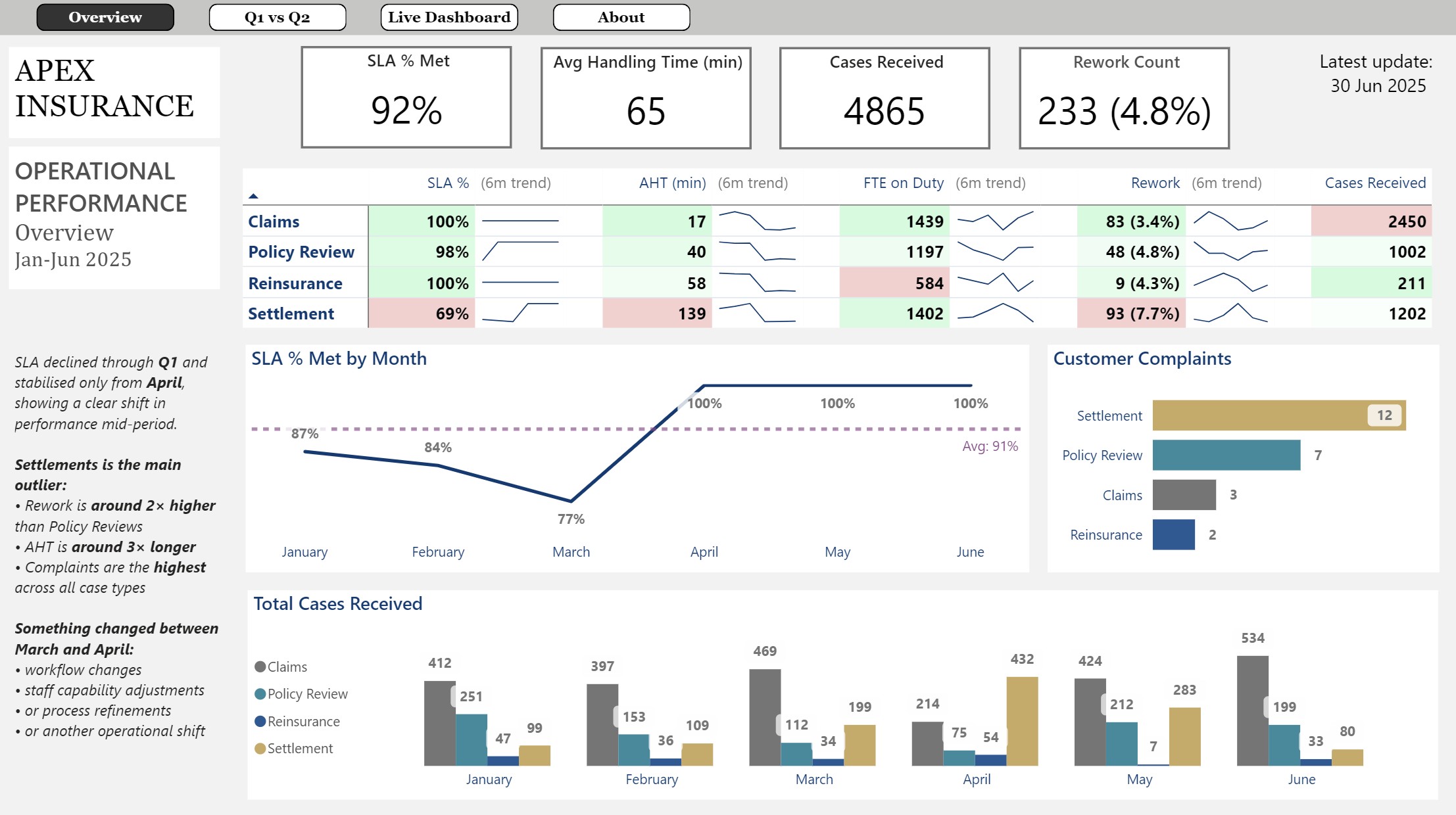
You can view the full interactive Power BI report here → Apex Insurance.
1. Objective: Why This Model Exists
This report is built on a fictional dataset designed to reflect how an insurance operations team works in practice. Both the company and the data are fictional and created solely to demonstrate operational analysis and reporting design.
The model follows a simple idea. Cases arrive, people handle them, some require rework, and each case either meets or misses the service level agreement. The aim is not to create a large dataset, but to show how much clarity you can achieve when the underlying structure is organised with intent.
- Purpose - Bring all relevant operational data into one place so the flow of work is easy to understand.
- Scope - Keep the focus on how decisions are made rather than how much data exists.
- Design principle - Keep things simple. Make the structure clear, reduce noise, and guide the reader through the model.
- Outcome - Show how well organised information can support practical and meaningful operational reasoning.
2. MI vs BI Reporting: How the Pages Serve Different Roles
To understand the report properly, it helps to recognise the two reporting styles it brings together. In most operational environments these sit separately, each serving a different purpose and audience. Here they are combined to give a more complete view of performance.
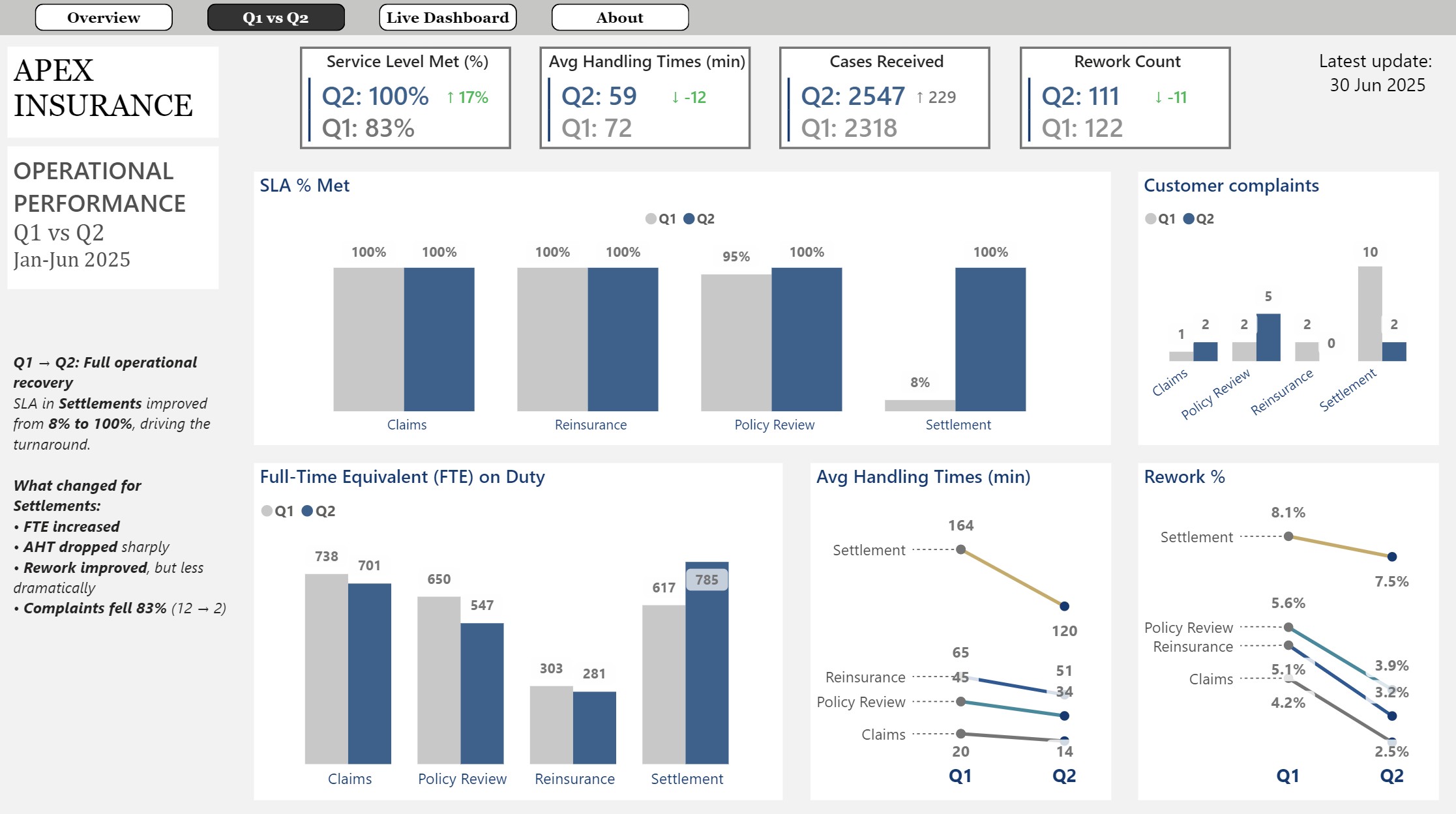
- MI reporting (Management Information) - Structured, curated, and focused on explaining what is happening and why. Used by senior stakeholders and decision-makers. Reflected in the 'Overview' and 'Q1 vs Q2' pages.
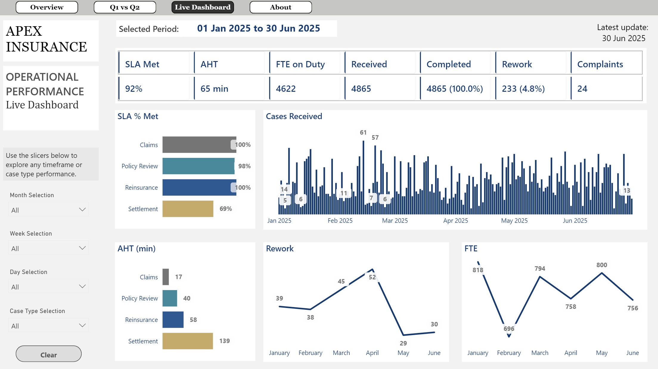
- BI dashboard (Business Intelligence) - Interactive, filter driven, and designed for day-to-day exploration. Used by operational teams and frontline managers. Reflected in the 'Live Dashboard' page.
3. Approach: How the Model Is Structured
Understanding the dashboard starts with understanding how the underlying model is built. The dataset reflects the core elements of a claims handling workflow. It includes four case types: Claims, Policy Review, Reinsurance, and Settlement. Each behaves differently in terms of volume, handling time, and operational pattern.
Cases arrive daily with defined attributes, move through handling, may require rework, and are completed either within or outside the service level agreement. The structure is intentionally simple so the behaviour is easy to follow.
- Clear inputs - Case type, arrival date, and the core attributes that shape how work enters the process.
- Consistent rules - Service level agreement (SLA), average handling time (AHT), and rework behaviour that define how cases progress.
- Visible constraints - Full time equivalent (FTE) levels that determine how much work can be completed.
- Straightforward outputs - Completion, delay, and quality outcomes that show how the workflow performs.
4. Logic: How the Business Process Behaves
Once the structure is in place, the next step is understanding how the workflow behaves day-to-day. The model keeps the flow simple. Cases come in, follow the same set of rules, and either move through smoothly or slow down when workload or timing changes.
- How work is judged - Whether cases are completed within the service level agreement or fall outside it.
- What gets attention first - Which case types are handled ahead of others when the team is busy.
- Where timing shifts - How handling time stretches or shortens depending on the conditions.
- What limits capacity - How staffing levels influence how much work can be completed and how stable the flow remains.
5. Insights: What the Dashboard Reveals
Once the behaviour is visible, the patterns become easy to understand. The dashboard shows where the workflow runs smoothly, where pressure builds, and where performance changes over time.
- Steady areas of the workflow - Claims and Policy Review move consistently with predictable handling times and strong service level performance.
- Points where work slows down - Settlement is the area where work slows, with longer handling times, more rework, and more complaints.
- Moments where performance improves - A clear shift appears mid-period when Settlement handling times fall and service level performance stabilises.
- What stays consistent - Reinsurance remains steady throughout and provides a reliable point of comparison.
- Measures that move together - Service level performance, handling time, rework, and complaints often rise or fall at the same time, making changes in the workflow easy to spot.
6. Implications: What the Signals Mean for Decisions
Once the patterns are clear, the implications become easy to interpret. The model shows how timing, quality, workload, and capacity interact, and what that means for day-to-day decisions.
- Clarity on workflow behaviour - The structure makes it easy to see which parts of the process run smoothly and which parts slow down.
- A clearer path to decisions - Changes in handling time, quality, or workload translate into practical actions when they are presented consistently.
- Room for the model to grow - The same logic can support larger datasets without needing to change the underlying structure.
- Insight from relationships, not volume - The value comes from how the measures connect to each other, not from the size of the dataset.
7. Closing Thought: The Core Principle
The model shows that meaningful insight comes from structure rather than scale. When the logic is clear and the relationships are easy to see, even a small dataset can support strong operational reasoning. The value lies in how intentionally the information is organised, not in how much of it exists.
Appendix: Model Structure and Reporting Layers
This appendix summarises how the model is built and what each reporting page contains. The dataset is fictional and designed to keep the logic visible, with daily records of workload, timing, quality, and capacity.
Reporting Pages
Page 1 — Overview (MI)
A summary of the period.
- Shows arrivals, completions, service level performance, handling times, rework, and complaints.
- Gives a clear view of overall flow and where the process is stable or under pressure.
- Reflects the type of summary used in senior reviews and executive MI.
Page 2 — Q1 vs Q2 (MI)
Compares the two periods side by side.
- Highlights how each case type behaves across Q1 and Q2.
- Shows where performance shifts, where delays build, and where recovery appears.
- Used for deeper MI analysis by senior operational leaders.
Page 3 — Live Dashboard (BI)
Designed for exploration.
- Includes filters for month, week, day, and case type.
- Allows users to drill into patterns, isolate behaviours, and test operational scenarios.
- Used by operational teams as part of day-to-day decision making.